PROJECT : 2
The Challenge: How can I create an engaging learning environment?
The Innovation portal was created as a resource for engineers to learn about Design Thinking, learn about what other colleagues were doing and to foster collaboration with colleagues. The project lasted about 6 weeks from user research, review of analytics, ideation, prototyping to delivery of final product.
Qualitative:
Going into the user research, I had some idea about what the pain points were from my own observations and interactions with the website. But I wanted to learn from the user’s standpoint what their take on the problems were. I spoke to the stakeholder as well as my teammates and some of the engineers who used the site.
- What I learned from the users:
- When they landed on the homepage, they didn’t know what the site had to offer.
- Users couldn’t navigate between sections of the site.
- There was no information readily available
Overall takeaway. The site was not viewed as a usable tool by the engineers. They couldn’t see the benefit for them of the site.
- What I learned from the stakeholder: The Goal of the Site:
- To introduce design thinking to engineers
- To help engineers incorporate design thinking into their work
- To foster collaboration among colleagues with other areas of specialty and/or experience
Quantitative:
I used the web analytics to look at the traffic on the site.
- What I learned from the analytics:
- Very high bounce rate
- An average of < 1 page viewed/clicked per visit
- Total minutes spent on the site was very low
- 0 downloads of information
- THE PLAN
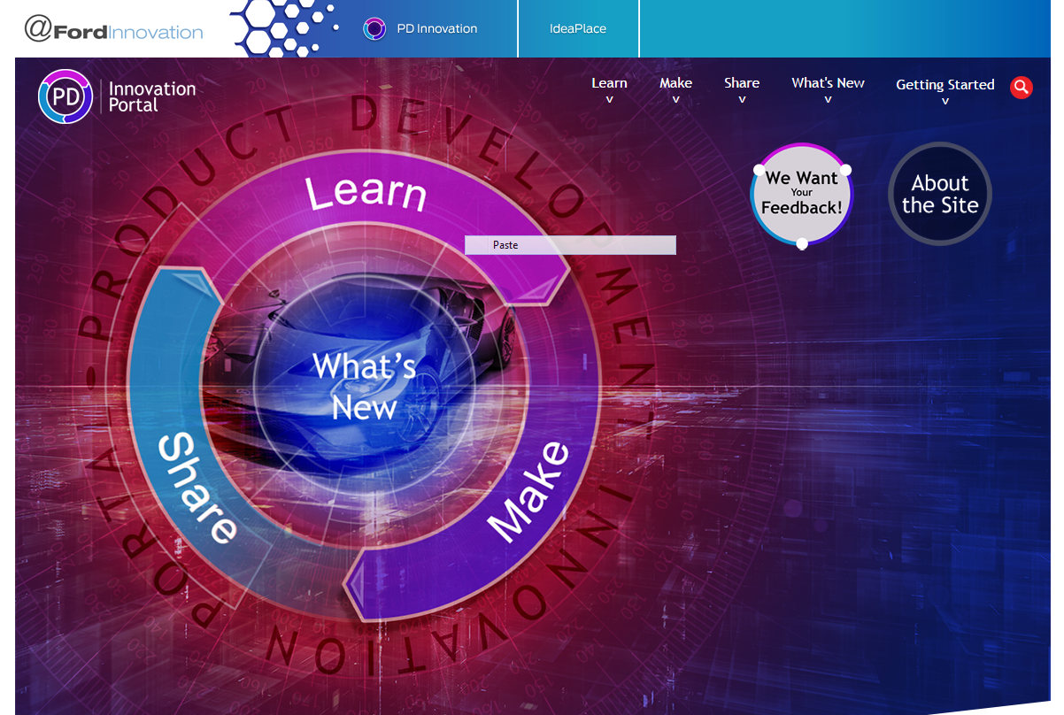
- To increase the overall minutes spent on the site, engage the user by defining the features/benefits of the website on the homepage:
- Add a hero image that will preview features in the sections of the website and link it to the section of the website that it was advertising.
- Add callouts of the areas of focus from the each of the various site sections:
- Learn
- Make
- Share
- What’s New
- Add calls to action
- Improve the navigation. Create a global navigation bar that was accessible in every section. Currently, once you access each section, there was only a menu bar that featured pages in that section. To access a different section, you had to go back to the homepage.
- Remove unnecessary pages. Delete the landing pages from each section.
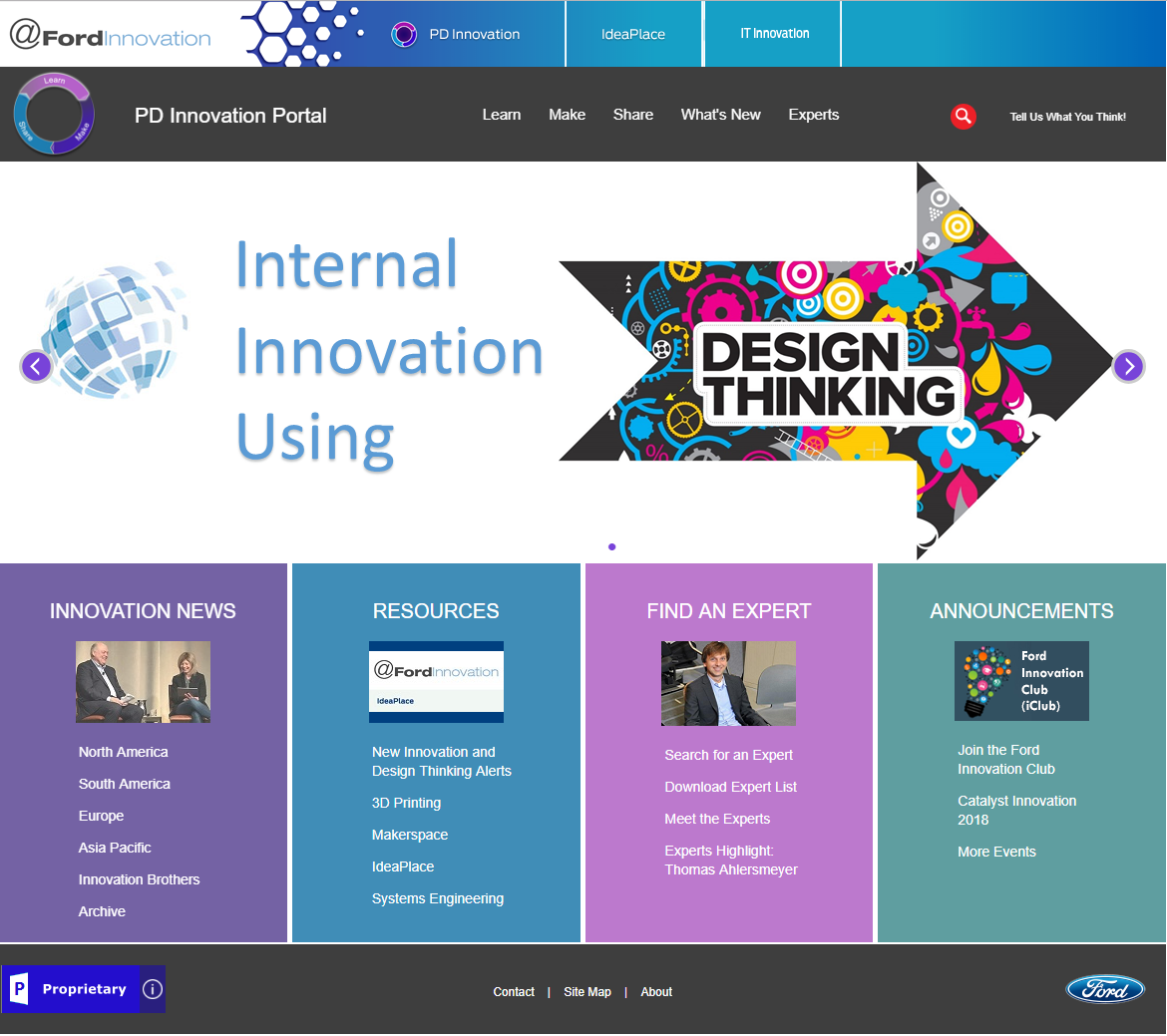
- The site was well received by users:
- They loved the improved navigation
- The Ask the Experts section became the most popular feature thus reaching the goal of improved collaboration. The experts list became the most downloaded item on the site as well.
- Users liked the slider because it told them what was new since they last visited and promoted upcoming events. They reported that they came to the homepage to see what was coming next.
- The callout boxes served their purpose as well. They allowed the stakeholders to display the highest priority information in a concise manner on the homepage. This was great advertisement of the site’s intended purpose. This helped the users because they didn’t have to hunt around for information that was likely to be relevant for them.
- Analytics:
- The bounce rate dropped dramatically.
- The number of pages visited increased dramatically.
- The average time spent on the site a.k.a. user engagement increased as well.