PROJECT : 1

The challenge: How do we capture and engage new users? How do we increase the conversion rate and improve overall user satisfaction?
- Qualitative:
- Customers want a more user-friendly menu. The menu gets in the way of viewing pages because it is sensitive and gets activated unintentionally. It is too long and, on a laptop, the PBE section gets cut off at the bottom such that the entire menu is not viewable.
- Stakeholders want to increase the conversion rate, increase dollars per conversion, decrease page and cart abandonment.
- we have a group of members who are repeat buyers of certain products and have brand loyalty.
- with our guest customers, how do we attract and encourage them to browse, buy multiple items and to become a repeat customer?
- Quantitative:
- Google Analytics – shows low usage of brand and other pages
- Hotjar – analysis shows cart abandonment rate
My Initial Observations
Poor Information Architecture
- The site is currently organized by category and brand. There is an opportunity to create an additional grouping and that should be by function. For example, if you buy a set a brakes, it’s likely that you will not want a second set of brakes by a different manufacturer. What you might want though would be brake pads, rotors, brake fluid etc.., Products that go together. So, we should either customize the site, or tag the items so they get grouped together. The short term fix would be to use imagery to present these groupings to the customer and link them to manually created function pages.
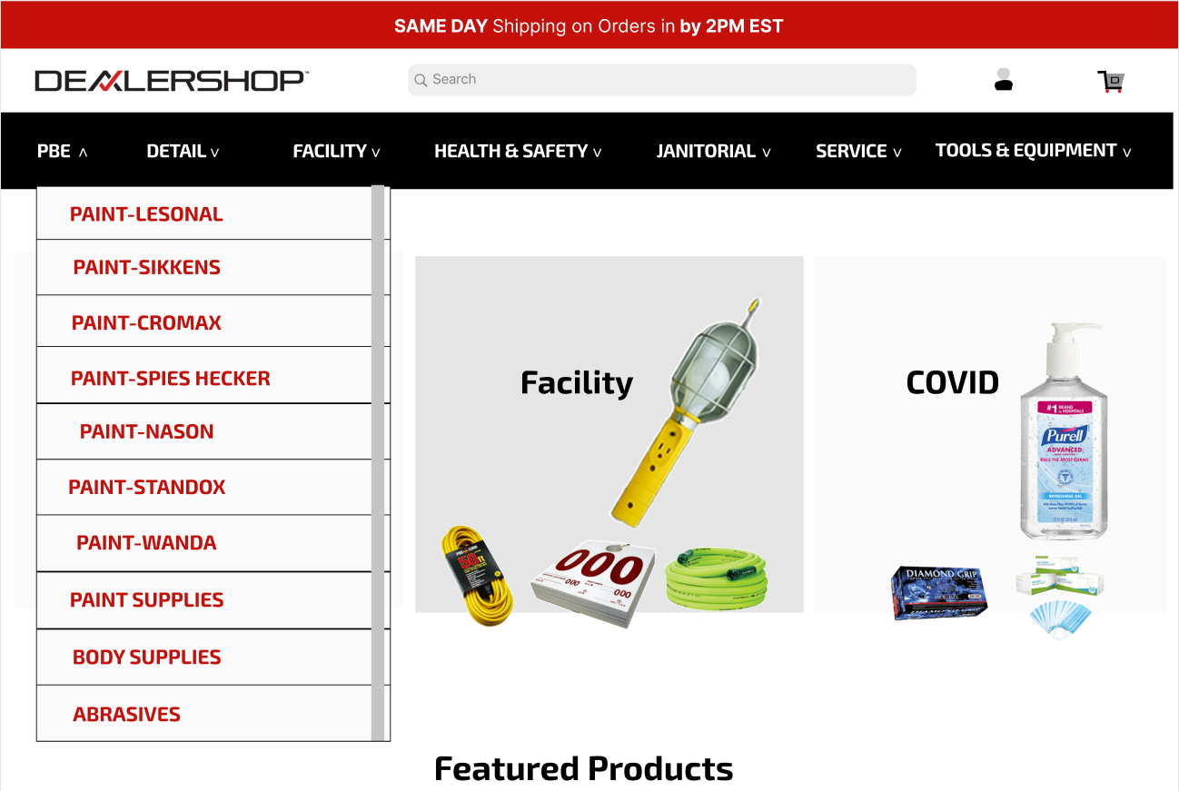
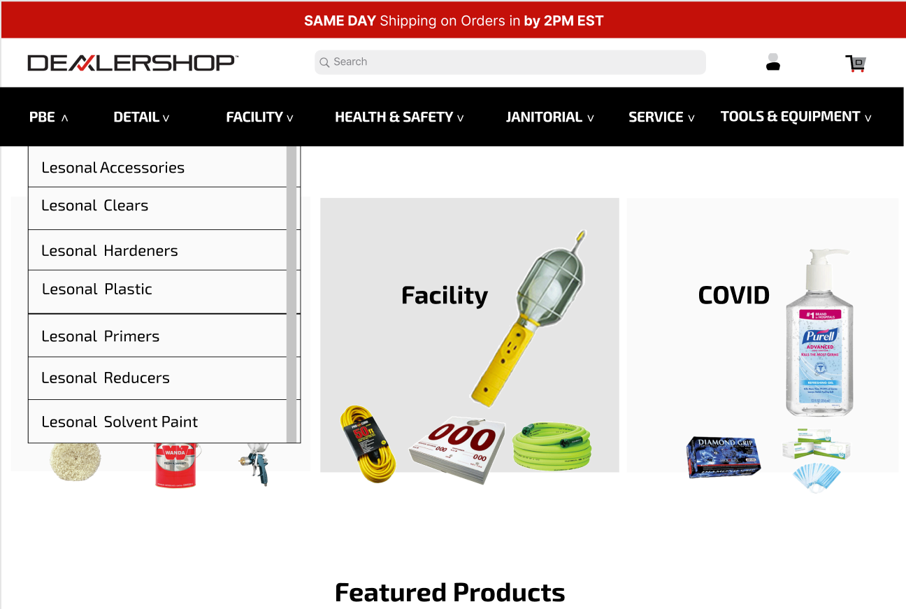
- The menu should display on “click” instead of on “hover”. Let’s reconfigure the menu so that it drops down when you click. Also, instead of dropping down horizontally, let the drop down be vertical with a scrolling feature so that it never gets too long to view all sections. Then when you click each section, it will fan out horizontally.
- Not enough products or benefits are displayed on the homepage. The homepage looks more like a corporate site than an ecommerce site. Need to add more product images and benefits of shopping with or becoming a member of DealerShop.
- Featured Products. Currently, when you click these boxes, they go to landing pages. They should go directly to the product pages. There is no need to send the user to an extra page that they have to then click a link to go to the product page. Not a good user journey.
- Product pages don’t have many calls to action. There isn’t much on the pages that encourage a customer to move to other sections.
- There are items such as “same day shipping on orders placed by 2pm” that are relevant for all buyers. Currently, this is only displayed at checkout. This should be noted more prominently to encourage closing the sale immediately.
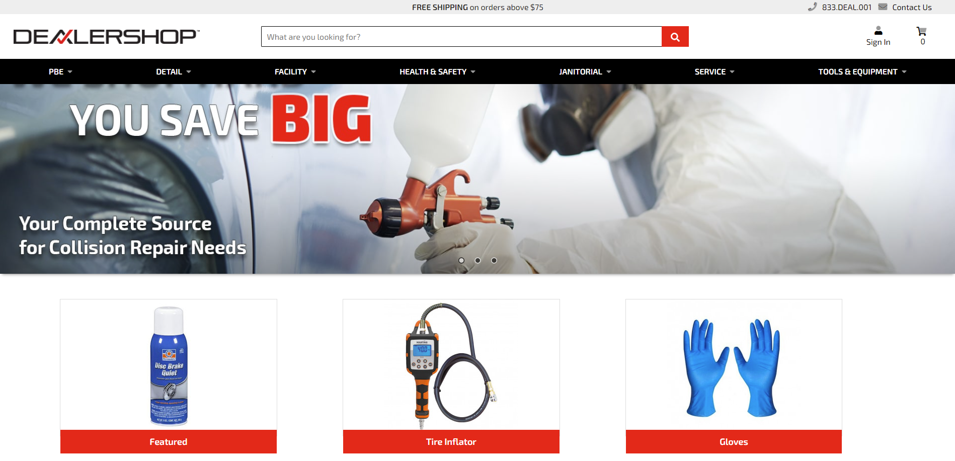

Challenge 1: The site does not adequately advertise product offerings. There are only 3 products located on the homepage. Throughout the site, products are only grouped by category or brand not by product function or task such as collision repair or stocking a facility.
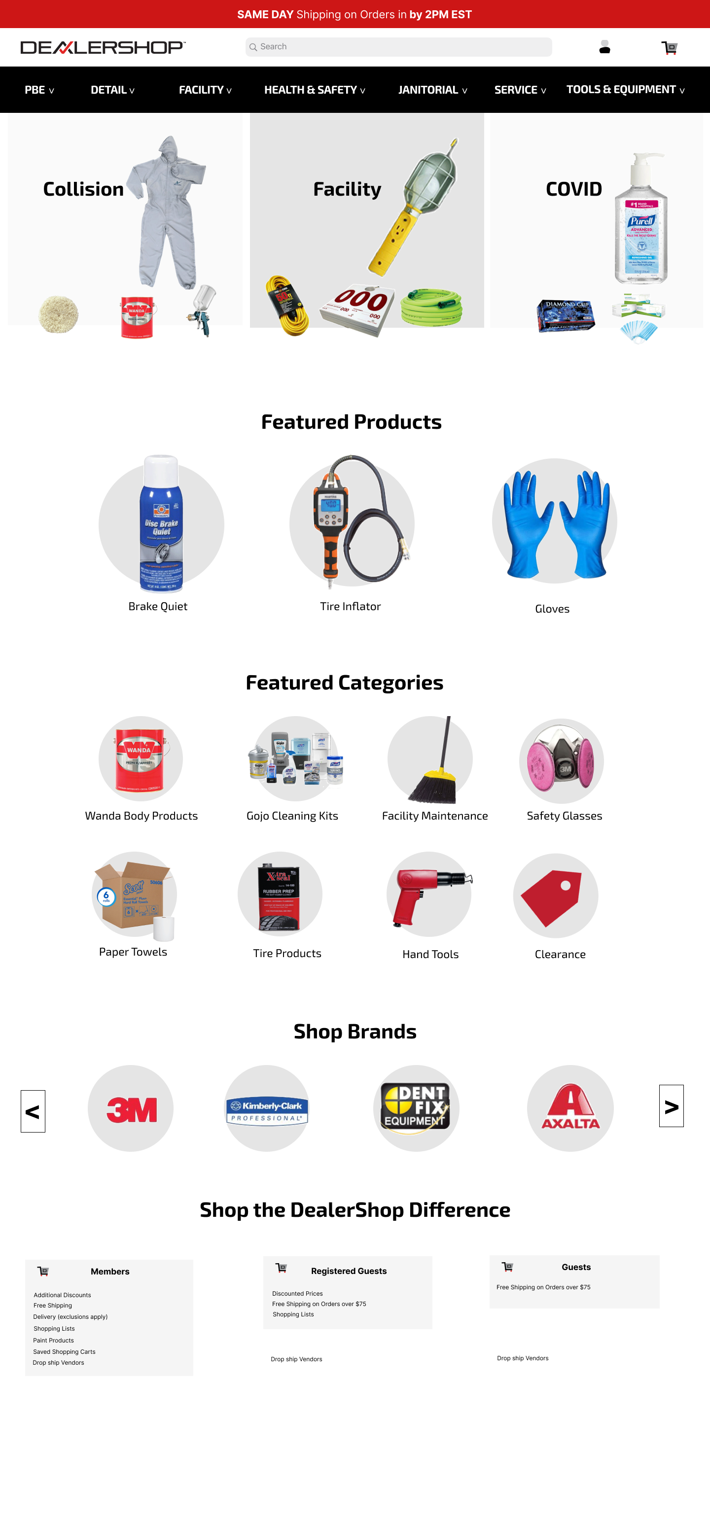
Solved: I created 3 collage images to represent product function/tasks. When clicked, user is taken to a product function page such as Collision Repair. Site should be modified (or use current tagging functionality) to group products by function.
Challenge 2: These featured products go to landing pages.The customer then has to click a link to go to a product page in order to add the product to their cart. This is an unnecessary customer journey.
Solved: Eliminate the landing pages and customize the site so that these boxes can link directly to the product pages.
We have created a list of the top performing and poorest performing products
from Google Analytics. Either group of products can be featured here to promote them. This section can be expanded beyond 3 products as well.
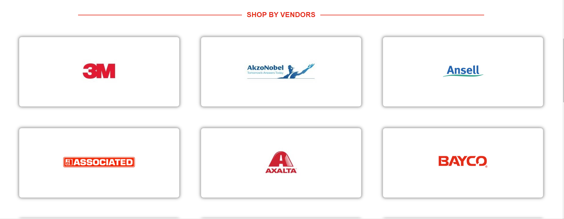
Challenge 3: The category and brand sections are too large. Once again stock images were used instead of actual products. A missed opportunity to advertise products.
Solved: I made the boxes into circles. This is a current design trend. I also reduced the size and more importantly, I used actual product images. Using another opportunity to display product offerings and I identified sub-categories to focus on and featured those in this as well.
Also, I made the brand boxes scrollable so that we can show all of them without them taking up real estate on the homepage.
Challenge 4: DealerShop has 3 customer levels. Members, Registered Guest and Guests. The benefits of signing up are not contained anywhere on the site.
Solved: I created feature boxes with bullet points to explain the different customer levels.
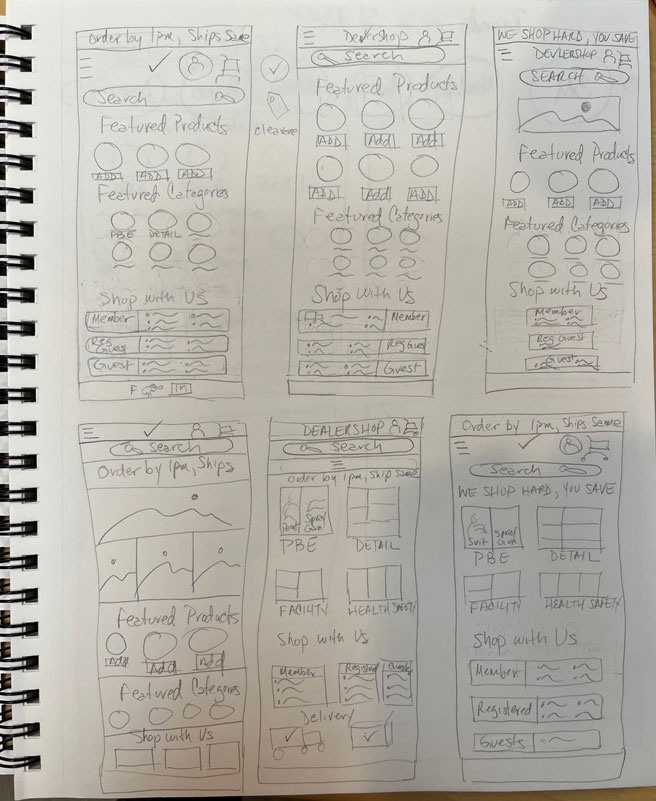
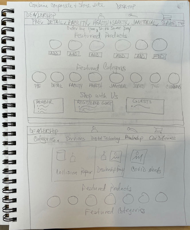
Created a Call to Action: Prominently displayed the order cut off time for same day shipping at the top of the site to encourage users to place their orders soon in order to get them shipping the same day.
Removed the message “Free Shipping on orders above $75”. This is not a universal message since it only applies to guest users. So, I moved this to the boxes that outline the three customer levels at the bottom of the page.

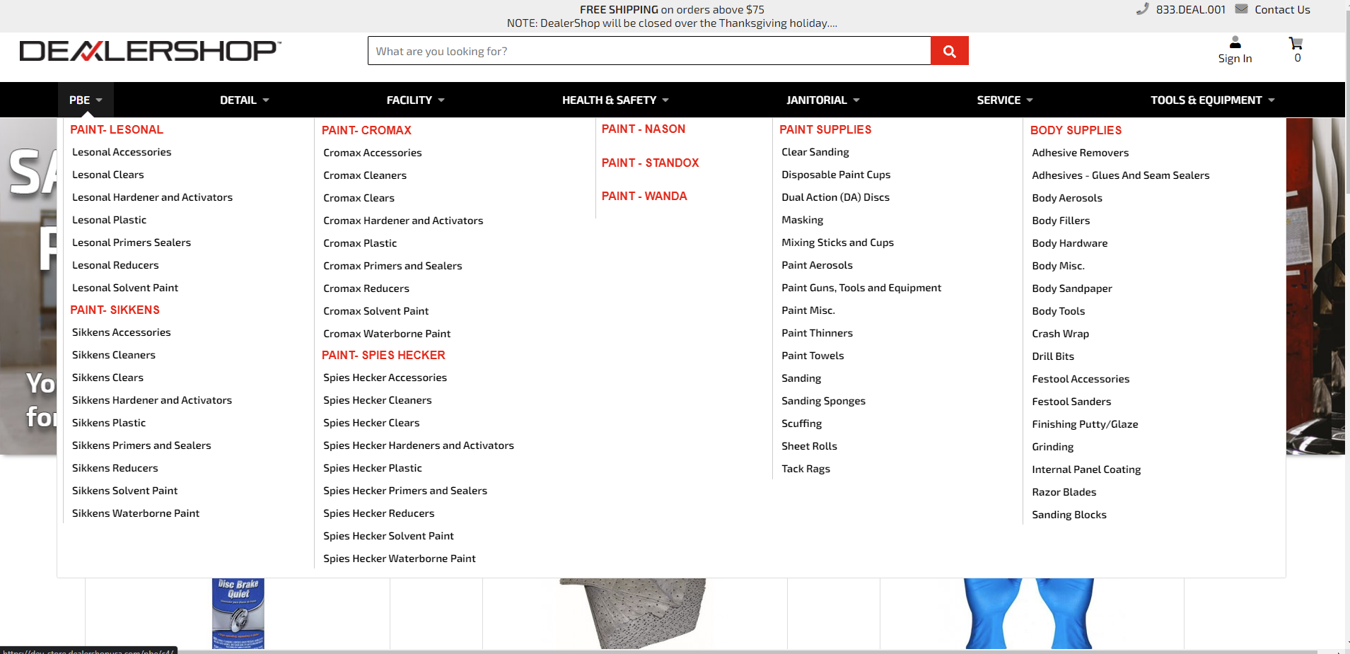
Challenge 5: The menu is too sensitive and drops down accidentally. The menu dropping down unintentionally gets in the way of navigating the page. This is cumbersome and irritated to user groups who are customers as well as employees.
Solved: The menu is activated on click now instead of on hover. And there is a scrolling feature so it only displays vertically,
and horizontally, one section at a time. It may be a good idea to add shop by function to the menu as well.
Menu level 2
Menu level 3
